Setting Up Custom Branding (Logo, Colors, Font & Button/Card Radius)
How to update the logo colors, font, and button/card radius within Concord for use in your unified Privacy Center and Consent Banner website experiences.
Overview
This document explains how to:
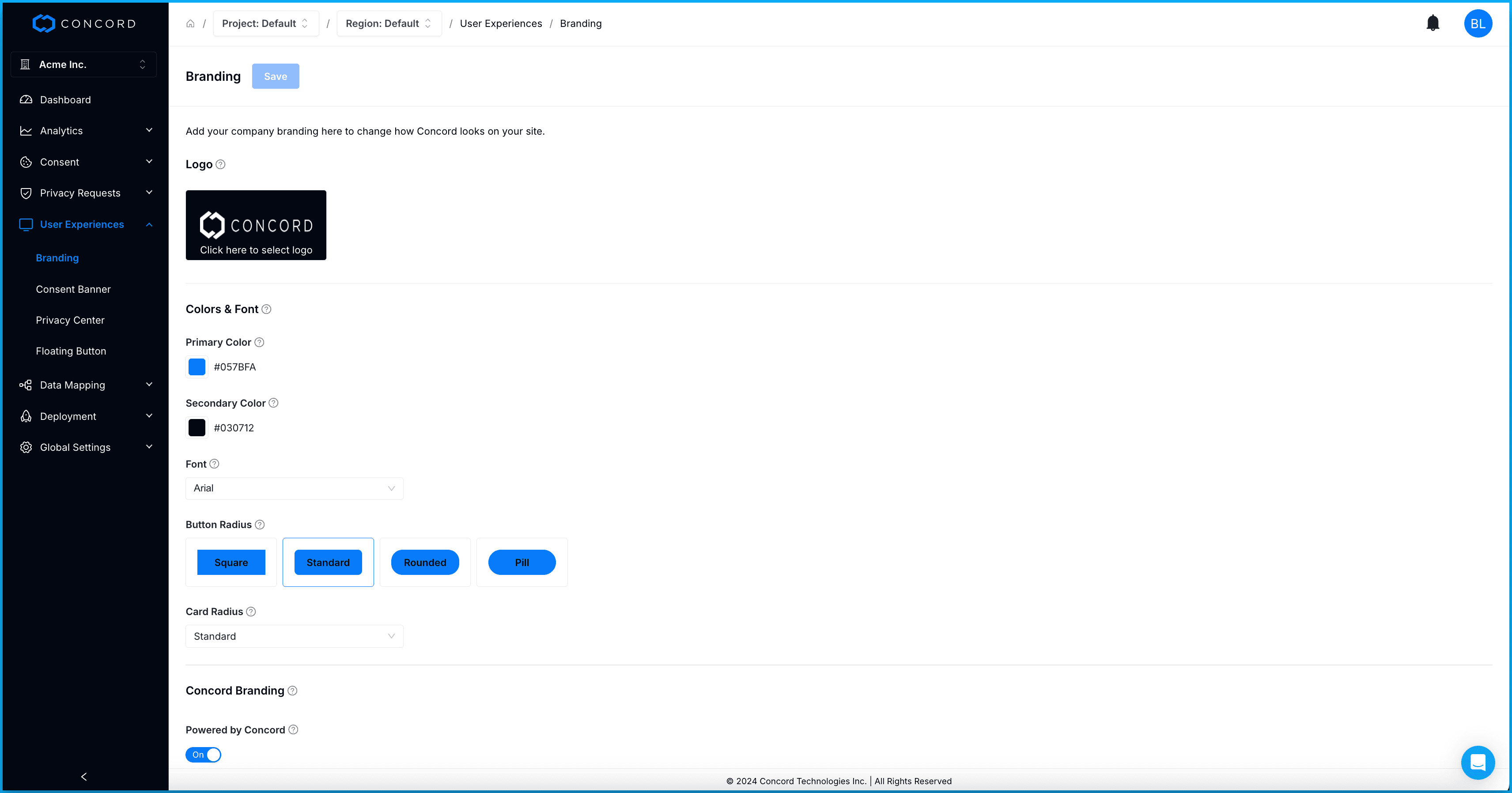
- Add your company logo in the branding section. The logo is used in your unified Privacy Center.
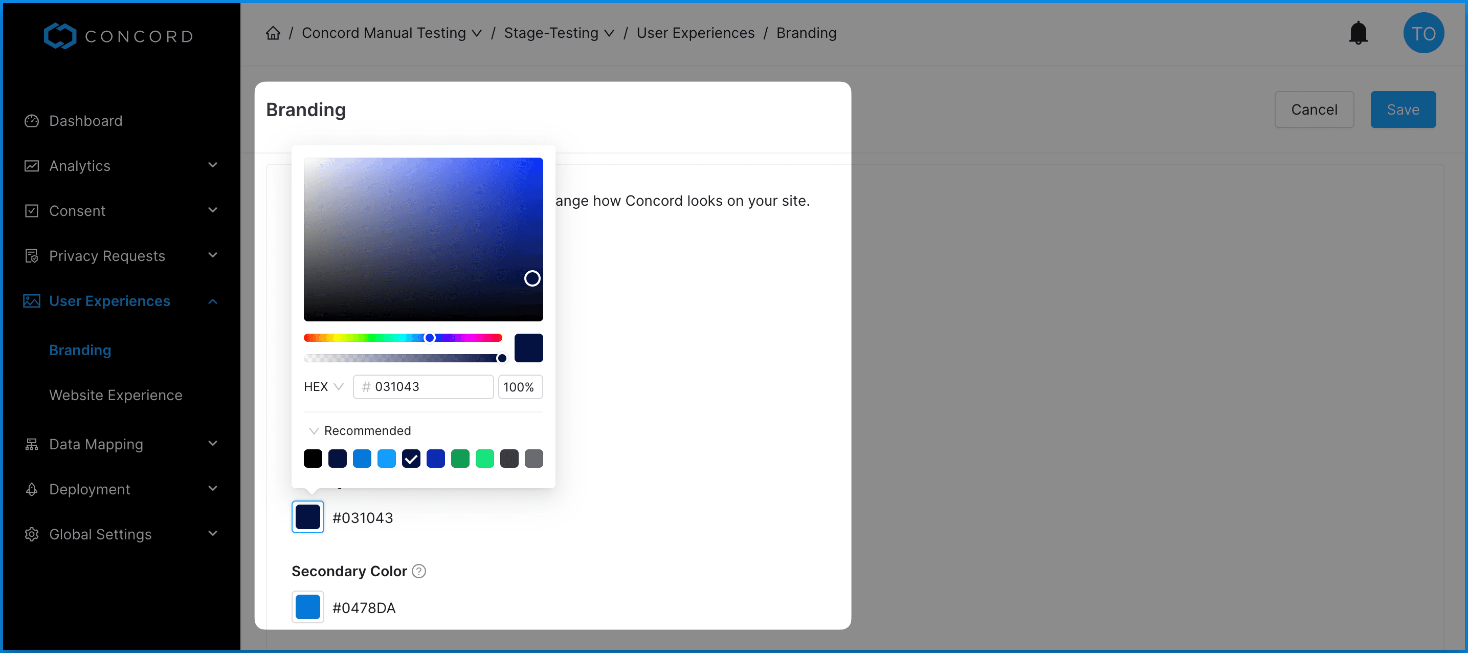
- Customize the primary and secondary colors in the branding section so they match your company’s desired look and feel. Primary and secondary colors are used in both the Consent Banner and the Privacy Center.
- Customize the font, button radius, and card radius in the Privacy Center and on the consent banner.
Logo
To customize your logo, go to User Experiences → Branding in the Admin UI.

Primary & Secondary Colors
Concord allows you you customize the branding of the Consent Banner and Privacy Center so they align with your desired look and feel. The secondary color is used for the background of the header in your Privacy Center and the primary color is used for buttons, links, switches, and other elements in your Consent Banner and Privacy Center.
To customize the primary and secondary colors, go to User Experiences → Branding in the Admin UI.

Customizing Font & Button/Card Radius
You can customize the font, button radius and card radius by going to User Experiences → Branding in the Admin UI.
- Font style can be changed to have a custom font in the Privacy Center and on the consent banner.
- Card radius settings will affect box/dialog consent borders and larger card styled items in the privacy center.
- Button radius settings will affect buttons in the consent banner and Privacy Center.